
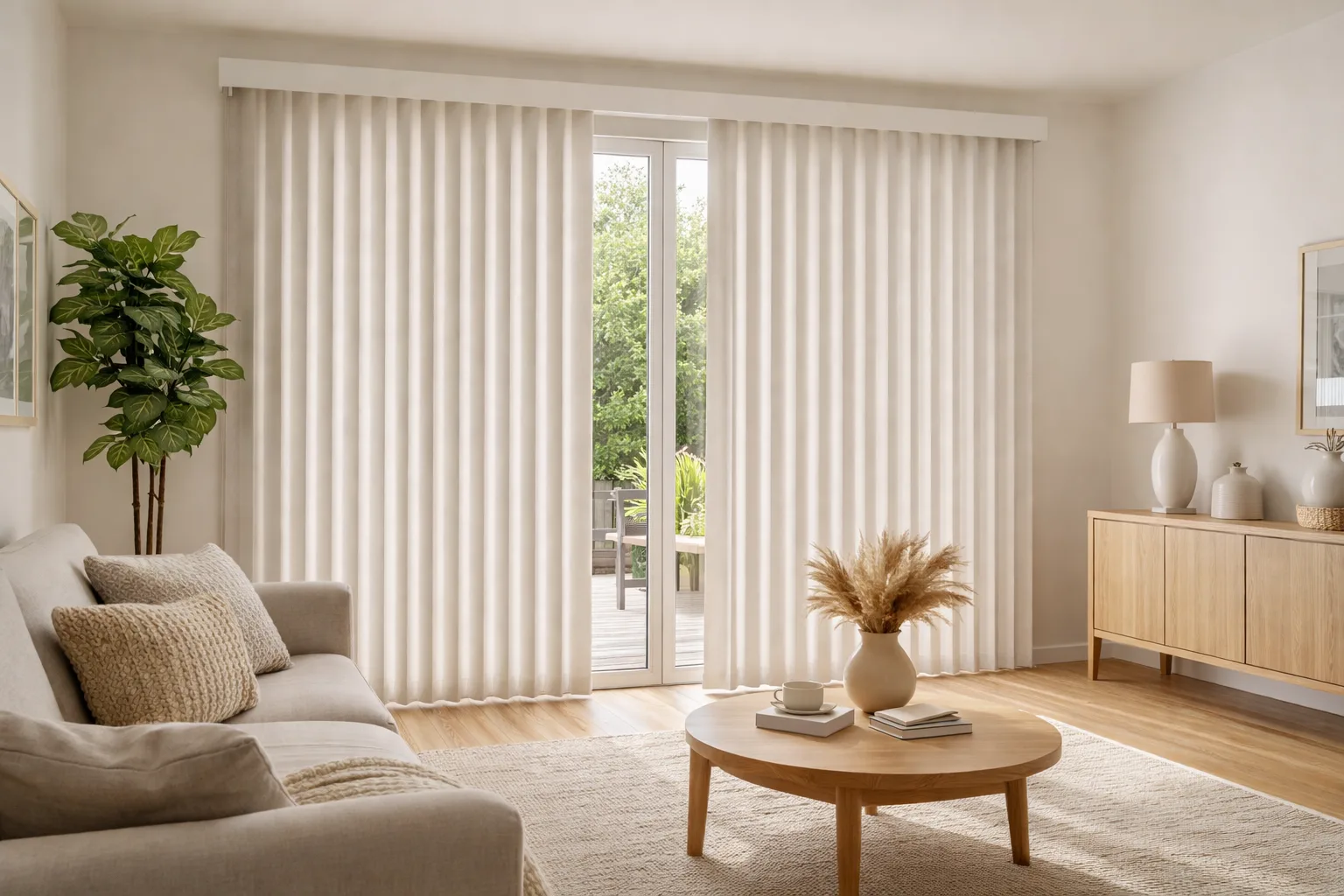

The best vertical blind colour is usually one pulled from something already in the room, most often the window trim, the wall colour or the floor, rather than the stark white that tends to be shown first. Match the trim if you want the blinds to disappear, match the walls if you want the window to feel part of the room, and choose a slightly deeper tone only when you want the blinds to be a feature. Texture matters almost as much as colour: it decides whether vertical blinds look modern and considered or plain and dated.
Why Vertical Blind Colour Matters More Than You’d Think
Vertical blinds usually go on the biggest openings in a home: patio doors, window walls and tall picture windows. That makes them one of the largest single surfaces in the room, often bigger than a sofa or a rug. A colour that’s slightly off is noticeable every day, while one that coordinates makes the whole room feel finished. It’s also a choice you live with for years, so a few minutes of comparing samples in the actual room is time well spent.
Three Ways to Choose a Colour
1. Match the trim to make the blinds blend in
If your window and door trim is white or off-white, a vane colour that matches it makes the blinds read as part of the architecture. This is the safest option for rooms with a lot going on, and for homeowners who plan to repaint the walls later. Take care with white: there are warm whites, cool whites and bright whites, and a vane that’s a shade cooler than the trim looks grey beside it.
2. Match the walls for a calm, seamless look
Choosing a vane close to the wall colour, or one shade lighter, lets a large window wall recede. It works especially well with soft greys, greige and warm beige walls, and it’s the look most people mean when they ask for “modern vertical blinds”.
3. Pull from an accent for a deliberate feature
A deeper tone taken from a rug, cabinetry or upholstery turns the blinds into a design element. Charcoal, taupe and deep neutrals work well in dining rooms and principal bedrooms. We’d avoid strong, saturated colours on very large doors, because a big block of bright colour is hard to live with and fades more visibly on sunny exposures.
Popular Vertical Blind Colours and Where They Work
| Colour family | Works well with | Keep in mind |
|---|---|---|
| Warm white and ivory | White trim, traditional and transitional rooms | Brighter than it looks on a sample; compare it against the trim |
| Soft grey and greige | Modern and open-concept spaces, grey or wood floors | Can look cold on north-facing windows; choose a warmer grey there |
| Beige, sand and linen tones | Warm wood floors, cream walls, family rooms | Forgiving with dust and fingerprints on busy patio doors |
| Taupe and mushroom | Dining rooms, principal bedrooms | Adds depth without feeling dark |
| Charcoal and deep neutrals | Contemporary rooms, black window frames | A bold choice; shows dust more than mid-tones |
How Light Changes the Colour You See
A vertical blind is seen from two sides: from inside the room, and with light coming through it from behind. Fabric vanes look noticeably warmer or cooler once the sun is behind them, and light filtering fabrics can take on the colour of the light coming in. That’s why a sample should be held up against the window, not just laid on a table.
- South and west exposures get strong, warm light; cooler greys and whites balance it well.
- North-facing rooms have cooler, flatter light, so warm neutrals keep them from feeling dull.
- Street-facing windows: remember that the back of the vanes is what neighbours see. Lighter, neutral tones look tidy from outside.
If glare is a problem in the room, colour alone won’t solve it; our guide on why light filtering blinds still let in glare explains what does.
Texture: The Detail That Makes Vertical Blinds Look Modern
Much of what makes older vertical blinds look like an office or a rental is the combination of narrow vanes, flat plastic and bright white. Changing the texture changes the whole feel.
- Smooth, matte fabric looks clean-lined and contemporary, and suits minimalist rooms.
- Linen-look and woven textures feel softer and more traditional, closer to drapery. They also hide dust and small marks better.
- Vinyl vanes are the most practical choice for kitchens and walkouts; a soft neutral in a subtle embossed finish looks far better than glossy white.
Vane width plays a part too. Wider vanes mean fewer seams across a large window, which gives a calmer, more current look. For a formal dining room, a textured fabric in a mid-tone often does more to elevate the space than colour on its own.
Coordinating Across an Open-Concept Floor Plan
In homes where the kitchen, dining and living areas share one sightline, the patio door and the nearby windows are all seen at once. Keeping the same vane colour and texture on every connected window, even if each area has slightly different accents, makes the space feel unified. If some of those windows have a different blind type, such as roller or zebra blinds, choose fabrics in the same colour family so they still read as a set. Our guide to choosing blinds for your home’s style covers mixing blind types in one space.
Tips for Choosing Samples at Home
- Look at samples in the room they’re for, at different times of day, not under store or screen lighting.
- Hold them against the trim and the wall side by side, so undertones are easy to compare.
- Check them with light behind them by holding the sample against the glass.
- Think about the whole sightline, including rooms visible from where you usually sit.
- Consider upkeep: mid-tones and textures are more forgiving on doors that get a lot of use.
During a free in-home measurement, we’ll talk through colours and textures against your actual walls, floors and light.
Frequently Asked Questions
What colour vertical blinds look best?
The colour that looks best is the one that relates to something in the room, usually the trim, walls or floor. Warm whites, soft greys and sand or linen tones are the most versatile. Deeper neutrals such as taupe and charcoal work when you want the window to be a feature.
Should vertical blinds match the walls or the trim?
Match the trim if you want the blinds to blend into the window frame, and the walls if you want a large window wall to recede into the room. Both work; the key is to match undertones so the colours don’t clash.
How can I make vertical blinds look more modern?
Choose wider vanes, a matte or textured fabric instead of glossy vinyl, and a soft neutral pulled from the room rather than bright white. Keeping the same colour and texture across connected windows also makes a big difference.
Do dark vertical blinds fade?
Any fabric can fade over time in strong sun, and colour changes are more noticeable on deep and saturated shades. On bright south- or west-facing doors, mid-tone neutrals are the lower-risk choice.
Find a Colour That Works in Your Room
Browse fabrics and vane styles on our custom vertical blinds page, and if you’re covering a patio door, see our guide to vertical blinds for sliding doors and large windows. We offer free in-home measurement across Mississauga, Toronto and the GTA, with samples you can hold against your own walls. Request your free quote, or send us a photo of the room and we’ll suggest colours that coordinate.